The Pages
The sidebar lists twelve pages, each answering one question about the window the top bar selects. Every one of them obeys the service filter and the time range of the top bar.
Overview
#/ answers whether anything is wrong right now.
It has five parts.
-
Stat tiles, in one row: requests, Apdex, error rate, p50, p95, p99, and rps. Each tile has the number large, the unit small, and a one-word caption. Colour appears only where it carries meaning. An error rate above 1% is red, a p95 above the slow threshold is amber, and Apdex is red below 0.7 and amber below 0.85. The Apdex tile reads
0.93, and its title says the T it was computed with. -
Findings: the five worst findings of the window, which are the UI’s side of findings. A row carries a severity dot (red for high, amber for medium, grey for low), the kind as a chip, the service chip, the title in bold, and the finding’s
whysentence dimmed on a second line. The first code frame follows in monospace when the finding has one. A row click goes where the finding points: the endpoint page, the query page, the error page, the JVM page for a pool or for the JVM itself, the Logs page filtered toERRORand the finding’s logger, and otherwise the first trace of its evidence. The panel head links to All findings. Acknowledged findings are left out here, so the five are always ones nobody has dismissed. With no finding in the window the panel saysNothing worth fixing in this window. -
Throughput and latency: a chart with a Requests | Load toggle in the panel head, remembered in the hash query as
chart=load. Requests draws the requests per time bucket as grey bars, with the errors stacked on top in red. Load splits the same bars into the four response-time buckets, stacked bottom-up in the bucket colours, with the errors on top. In both, p95 is a line on a second y-axis in the accent colour. Beside it, the Response summary draws five vertical bars, one per response-time bucket and one for errors, with the count above each bar and the label beneath. The tallest bar sets the scale, and a tooltip gives each bar’s share. The bars are labelled from the bucket bounds,≤125 ms,≤500 ms,≤2 s,>2 s, anderror, and they keep those colours wherever a histogram or a load chart appears. Below 900 px the chart and the summary stack. -
Services: one card per service, with the name, the language chip, an
embeddedchip where it applies, rps, p95, error rate, Apdex, a sparkline, and a JVM link when the service reports JVM metrics. A click opens the service page. -
Tingles: the feed of slow requests, slow queries and errors, newest first. Each entry has an icon for its kind (a turtle for a slow request, a database for a slow query, a bolt for an error), the service chip, a title, a detail, and a relative time. A click opens the trace. With Live on, new tingles slide in at the top.
Before any service has sent anything, the page shows the logo, one sentence, and the snippet: the -javaagent line, the OTEL_EXPORTER_OTLP_ENDPOINT and OTEL_EXPORTER_OTLP_PROTOCOL pair, and a curl for OTLP/JSON.
Findings
#/findings is the ranked list of what is worth fixing in the window, up to 100 rows.
It shows what findings gives an agent, in the same order.
The table has the position, the severity as a dot and a word, the kind chip, the service chip, the title, and in a right-aligned column the number the kind is ranked by.
That number is the count for error and log-error, the median repeats times the endpoints affected (42 × 3) for n-plus-one, the total time for slow-query, slow-endpoint, slow-job and slow-external, the peak pending requests for pool-exhausted, the worst pause for gc-pause, the peak ratio as a percentage for heap-pressure, and the growth for thread-growth.
A row click expands it in place into the evidence: the why sentence, the kind’s numbers as a grid of keys and values, the statement pretty-printed when there is one, the code frames as a monospace list, and the traces as links to the trace page.
callers and endpoints appear as a short list, and hotSpan as one line.
The row also carries a Go to link to the subject’s page, the destination the Overview’s row click uses.
An expanded row stays expanded across a Live refresh while the finding is still in the list.
An acknowledged finding is listed after the others, dimmed, with acked in its severity cell and the note as its title.
The expanded evidence of any finding ends with an Acknowledge button, which asks for an optional note.
An acknowledged finding shows the note and an Unacknowledge button instead.
The empty state says Nothing worth fixing in this window. and names the window, or shows the snippet when there was no request at all.
Compare
#/compare puts two windows side by side, [before, after) and [after, until).
It shows what compare gives an agent.
A bar above the content holds the Before and After selects, the Until select, and a Compare button.
Before and After list the marks newest first as name · time · service, the automatic start marks among them.
Until lists the same marks plus now, which is the default.
The three selectors live in the hash query, so a comparison can be shared as a URL.
When the URL names neither window, the page takes the two newest marks, the newest as After and the one before it as Before.
With fewer than two marks the page says two marks are needed, offers the Mark dialog, and shows the mark before command in a copyable block.
Four panels follow.
Totals is a row of tiles, each reading before → after with the after value large: requests, errors, p95, and Apdex.
The arrow and the after value are red when that side got worse, and green when it got better.
Worse means the errors grew, or the p95 grew by more than 20% and 10 ms, or the Apdex fell.
Endpoints is a table, worst first: a verdict chip (worse red, better green, new and gone grey, same plain), the name with its service chip, then calls, errors, p50, p95, max, db calls per request, and db ms per request.
Every cell reads before → after, with a dash for a side that has no value.
A row click opens the endpoint page.
Queries has the same shape, with the statement in monospace on one line, calls, calls per request, p95, and total. A row click opens the query page.
Errors lists the verdict, the type, the message, the service chip, and the counts before and after. A row click opens the error page.
Live is honoured here as on every page, but only until = now moves with the clock.
The marks stay where they are.
Map
#/map draws the services, the databases and the external hosts as nodes, and the calls between them as edges.
The layout runs left to right in columns: the user node first, then the services ordered by their distance from a source, then the external nodes in the last column.
Nodes within a column are sorted by name and spaced evenly.
The layout is computed once per set of nodes and kept while Live refreshes the numbers, so nodes do not jump.
A node is a rounded rectangle with an icon for its kind, the name, and for a service a second line of rps, p95 and error rate with a five-bar histogram in the bucket colours. The full name is in the tooltip when it does not fit. The border turns red when the error rate is over 1%, and amber when the Apdex is under 0.85. The service filter dims every node and edge that is neither the chosen service nor one of its neighbours.
An edge is a curve from the caller to the callee with an arrowhead. It grows thicker with the number of calls, and turns red when the edge carries errors. Its label gives the calls, and the errors in red when there are any. The average and the p95 are in the hover tooltip. Hovering a node or an edge highlights it and its neighbours.
A click on a node opens a drawer on the right. For a service the drawer holds the stat tiles (requests, Apdex, error rate, p95, rps), the Response summary bars, the Load chart for the window, and buttons for Service, Scatter and Traces, each filtered to that service. For an external node it holds the calls, the errors, the average, the p95, and the services that call it with their counts.
On a narrow screen the map scrolls horizontally inside its panel. When no call has been traced at all, the page shows the snippet instead.
Services
#/services lists every service: name, language, requests, rps, error rate, Apdex, p50, p95, p99, a sparkline, and when it was last seen.
A row click opens the service.
#/services/{name} is the service itself, in seven parts.
-
A header with the name, the resource chips (language, runtime and version, host, pid), a JVM button when the service reports JVM metrics, a Traces button, and the compact Response summary on the right.
-
The stat tiles of the Overview: requests, Apdex, error rate, p50, p95, p99, and rps.
-
Three charts in a row: requests, latency at p50, p95 and p99, and error rate as a percentage. The first carries the Requests | Load toggle of the Overview and defaults to Load. The choice is shared with the Overview through the hash query.
-
The Endpoints table: method chip, route, calls, rps, Apdex, avg, p50, p95, p99, max, errors, and a status-code mini-bar (2xx green, 4xx amber, 5xx red). Clicking a header sorts by that column, and the default is total time. A row click opens the endpoint.
-
Top queries and Top errors, side by side. Top queries gives the statement in monospace on one line, calls, avg, p95 and total. Top errors gives the type, the message, the count and when it was last seen. Both link to their own page.
-
Dependencies: kind icon, target, calls, errors, avg, and p95.
-
Resource attributes, as a collapsed table of keys and values.
Endpoint
#/endpoints/{endpointId} is one route of one service.
The header gives the method, the route, the service, the Apdex and the compact Response summary.
The same three charts follow, with the same Requests | Load toggle.
Under them are four tabs: Slowest traces, Recent traces, Queries, and Errors.
The trace rows are the rows of the Traces page.
Scatter
#/scatter puts every request on one chart, time on the x-axis and response time on the y-axis.
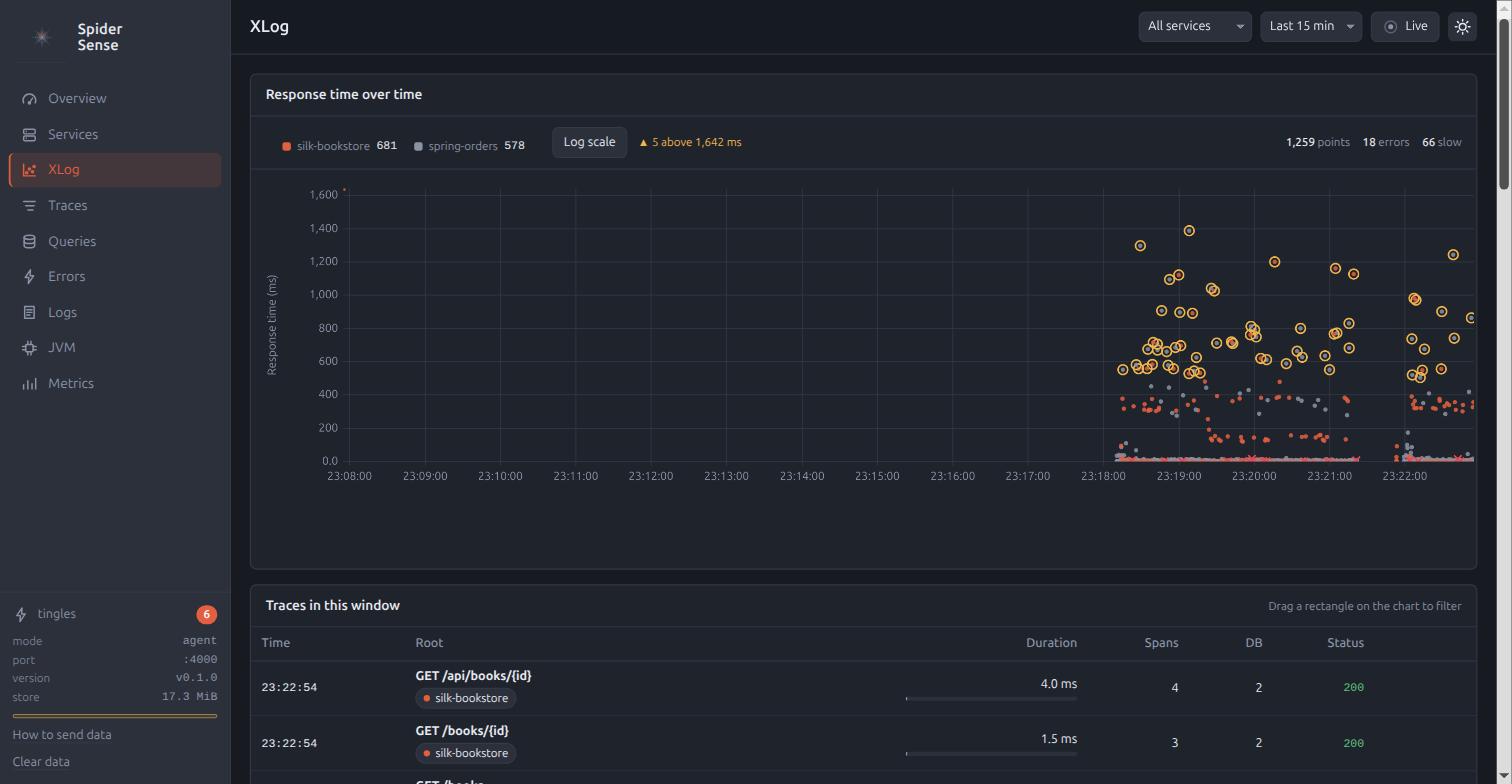
The chart has two modes, Dots and Heatmap, chosen with a toggle above it and remembered in the hash query as mode=heatmap.
Dots is the default: one 3 px dot per request in its service’s colour, errors drawn as red crosses on top, and slow requests ringed in amber.
The y-axis is linear, with its maximum at the window’s p99 times 1.5 and a ▲ n above note for the points that fall outside it.
The Log scale toggle switches the axis.
Heatmap is the mode for a dense window: the plot area is divided into cells, each filled in the accent colour with an opacity that follows its count against the densest cell, and a cell holding an error is outlined in red.
Hovering a cell gives its time span, its response-time span, its count and its errors.
Above the chart sit the legend of services (click one to hide or show it), the Success and Failed toggles, the Log scale toggle, the mode toggle, the counts of points, errors and slow requests, and a notice when the list was truncated. Success and Failed both start on. Turning one off hides those points, and the counts, the selection and the y-axis maximum follow.
Drag a rectangle in either mode to list the traces inside it, in a table beneath the chart.
The rectangle gives the time range and the duration range, and the current service and the Success and Failed toggles apply to it.
Esc clears the selection.
In Dots, hovering a point gives the endpoint, the service, the duration and the time, and a click opens the trace.
With Live on, points stream in from the right every 2 seconds and the x-axis slides.
Traces
#/traces lists the requests, and #/traces/{traceId} is one of them.
The list
The query bar takes free text, a duration range as two small number fields, a status of all, error or ok, and an endpoint when a service is selected.
Enter applies it, and so does a short pause in typing.
The table gives the time, the root name in bold with the service chips, the duration with a bar proportional to the slowest row, the span count, the DB calls, the status code, and the error and slow markers.
Newest first, with Load more under it.
The header
A trace opens with its root name, the trace id in monospace (click it to copy), the start time, the total duration, the services, the span count and the error count. The buttons are the Waterfall / Profile toggle, Export, and a log count that jumps to the log records.
Waterfall
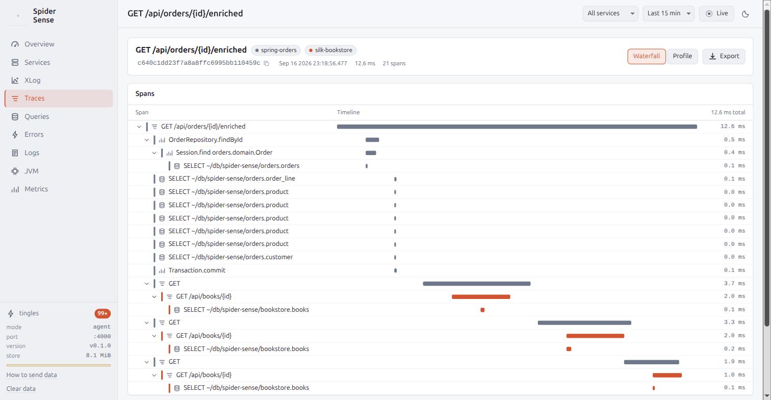
The waterfall is the default view, a tree of spans indented by depth with collapsible nodes. A row has a service colour bar, the name, a category icon, the span’s bar on the time axis the whole trace shares, and the duration. An error has a red bar and a bolt, and a slow database span an amber ring. A row click opens the span drawer.
The span drawer
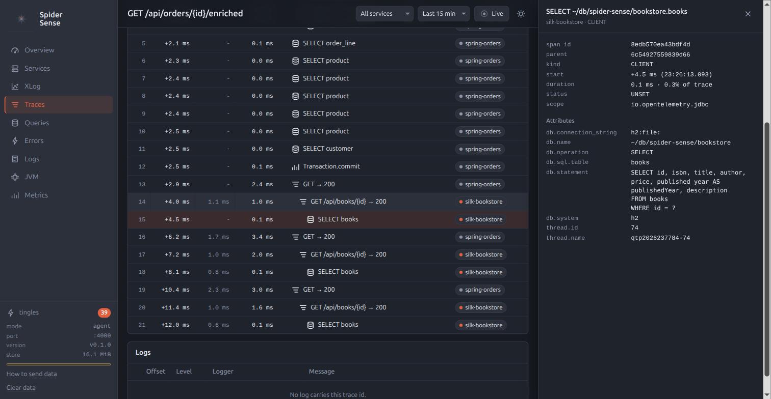
The drawer opens on the right with the span’s name, service and kind, its timing (start offset, duration, share of the trace, self time), and its status.
Then come the attributes as a table of keys and values, with long values in a block of their own and db.statement pretty-printed.
The events follow with their attributes and the stack trace in a scrollable block, and the scope name comes last.
Esc closes the drawer.
Profile
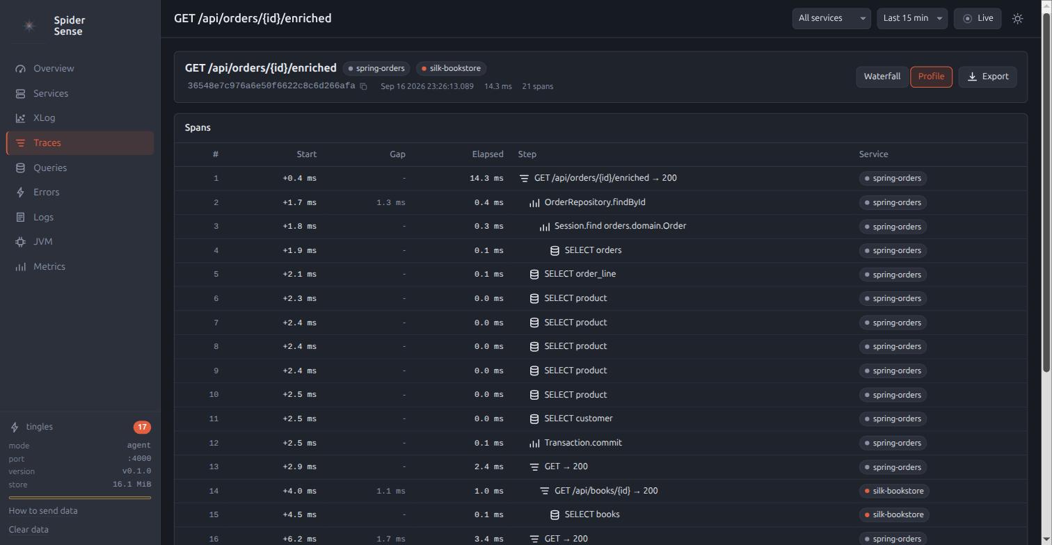
The profile is the view for reading what a request did, in order, and where the time went.
It lists the same spans as a flat table: the position, the start offset (+12.3 ms), the gap since the previous step, the elapsed time, the self time, the self time as a % of the trace, the depth as indentation, a one-line summary such as SELECT orders … (h2), and the service.
Self time is the elapsed time minus the durations of the direct children, never below zero.
The order is chronological.
Clicking the Elapsed or Self header sorts by it, descending, and the gap column then reads -.
Clicking the Start header restores the chronological order.
The three largest self times that are at least 5% of the trace are marked hot, so the step that spent the time is visible without reading every row.
A step over the slow threshold is tinted amber, and an error red.
Queries
#/queries groups the SQL statements as the agent sanitised them.
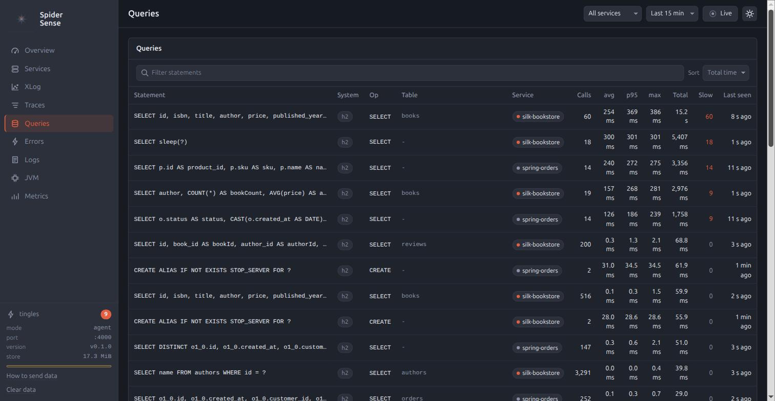
Above the table are a sort selector (total, avg, p95, max, calls) and a text filter on the statement. The table gives the statement in monospace on one line, with the full text in its tooltip, then the system chip, the operation, the table, calls, avg, p95, max, total, the slow calls (in the accent colour when there are any), and when it was last seen. A row click opens the statement.
#/queries/{queryId} is one statement: the full text pretty-printed, the stat tiles, a chart of calls and p95, the callers as endpoints with their counts, and the slowest traces.
Errors
#/errors groups the exceptions by type and message.
A row gives the type in monospace with the package dimmed, the message, the service chip, the count, when it was first and last seen, and the endpoints as chips, the first two and then +n.
A row click opens the error.
#/errors/{errorId} gives the header, a chart of the count, a sample stack trace, the endpoints, and the recent traces.
The application’s own frames are highlighted in the stack trace, which are the frames whose package matches the top-level package of the first frame.
Logs
#/logs is the application’s log records.
The query bar takes free text, a minimum severity, and a trace id, which is prefilled when you arrive from a trace.
The table is dense: the time to the millisecond, a severity chip coloured by level, the service chip, the logger dimmed, the body with its newlines kept, and a link to the trace when the record carries one.
A row click expands its attributes and its stack trace.
Load more pages further back.
With Live on the page tails: new lines arrive at the top, and the scroll position is kept unless you are already at the top.
JVM
#/jvm needs one service, so choose it in the top bar.
While the filter is on all services, the page offers a picker of the services that report JVM metrics.
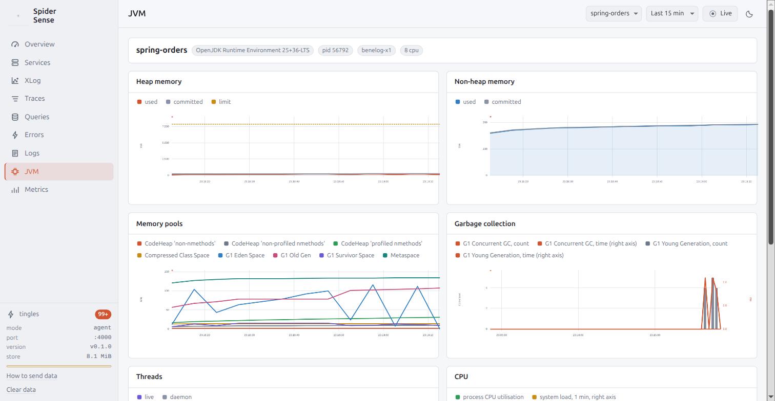
A runtime header gives the JVM, the pid, the host and the CPU count.
Under it is a two-column grid of charts: heap used, committed and limit, non-heap used and committed, the memory pools with one line per pool, GC count and duration as bars, threads, CPU utilisation from 0 to 100% with the system load, and loaded classes.
One Connection pool chart follows per pool, with the pool’s name in the panel title.
It draws the connections in use as an accent area, the idle ones as a grey line, the maximum as a dashed amber line, and the pending requests as red bars on a right-hand axis.
The axes carry their units, MiB, ms, %, and connections.
Metrics
#/metrics is the explorer for every metric that arrived.
The catalog on the left is searchable, and lists each metric’s name, type chip, unit and series count.
The chart on the right draws the selected metric over the window, one line per series, with a legend of the series' attributes.
A rate toggle applies to sums.
A histogram is drawn as its mean and p95, with the count as bars beneath.
Numbers and times
Durations carry one decimal below 100 ms and none above, and are given in seconds above 10 s.
Counts carry thousands separators, rates two decimals, and percentages one.
A count axis only ever shows whole numbers, so a series that stays at 0 or 1 does not print the same tick three times.
Times read as HH:mm:ss within today, and MMM d HH:mm:ss otherwise.
A feed gives the relative time, "12 s ago", a table the absolute one, and a tooltip both.
Every list re-renders in place when Live refreshes it, without losing the scroll position or the selection.
The whole UI works at 360 px wide: a table scrolls horizontally inside its panel, the charts shrink, and the drawer becomes a full-screen sheet.
It makes no external request at all, since the fonts are the system’s, the chart library is vendored, and the logo is inline.